
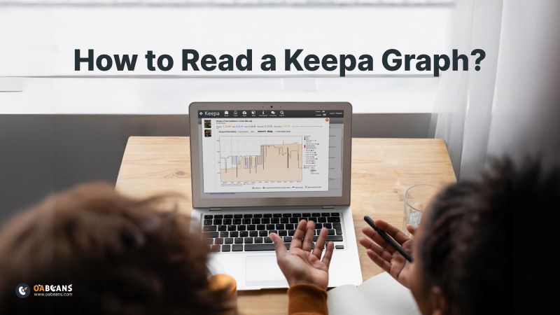
What Is Keepa and Why Is It Essential for Amazon Sellers?
Before we talk about how to read a Keepa graph, let’s first understand what Keepa is.
Keepa is one of the most reliable and essential tools for Amazon sellers. It offers comprehensive price and sales rank tracking for a wide range of products. This tool helps sellers gather important historical data such as price fluctuations, Buy Box data, sales rank trends and marketplace changes.
With this data, sellers can make better, more informed decisions. The insights from Keepa are extremely valuable for optimizing pricing strategies, understanding market demand and increasing profitability.
If you want to learn more about Keepa, we’ve written a complete Keepa review article that you can read to boost your knowledge and take your online selling to the next level.
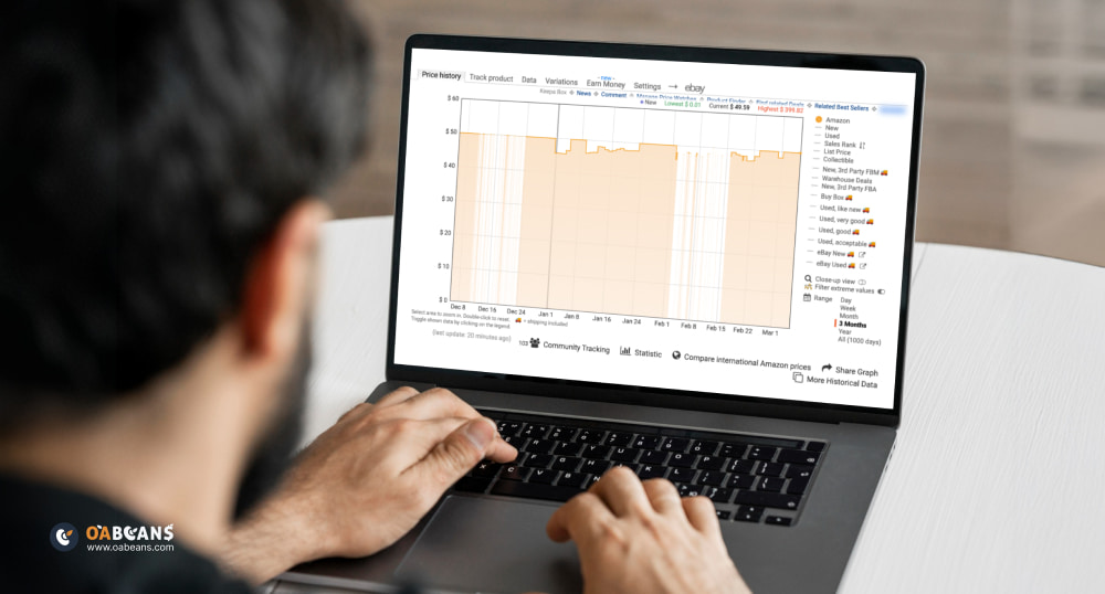
Basics of a Keepa Graph
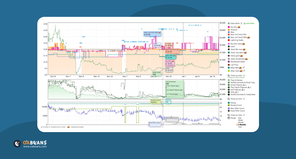
Before explaining how to read a Keepa graph in detail, it’s important to first understand the different parts of the graph and the information each one gives you.
- On the left side, you can see the price levels, which show how much the product costs.
- At the bottom, there is a date table that shows you the timeline, so you can track how the data changes over time.
- On the right side, you’ll see the sales rank. Know that a lower sales rank means better sales. This side of the chart also includes a menu where you can choose what information you want to display. For example, you can choose to view Amazon’s price, used prices, sales rank, and more. You can also select a time range from 1 day to all time.
After understanding these parts, let’s look at the meaning of the different colors and shapes in the Keepa chart.
- Orange area = Amazon is selling the product.
- Purple line =Lowest price for a New product from other sellers or Amazon.
- Black line =Lowest price for a Used product.
- Green line =Sales Rank (shows how well the product is selling).
- Pink line/diamonds = The Buy Box price (price shown first to buyers).
- Orange triangle = Lowest price from a New FBA seller.
- Blue square = Lowest price from a New FBM seller.
- Yellow/gold line = Estimated units sold per month
For sellers looking to use Keepa more effectively, we’ve created a complete article that explains How to Use Keepa for Smart OA Purchases.
Interpreting Price Fluctuations and Trends
One of the most valuable parts of Keepa is interpreting price fluctuations and trends. You can look at the current price of a product over a long period and see how the price has changed over the past days, weeks, or even months.
When you’re viewing a Keepa chart, you’ll see a graph that shows price movement using different lines and shapes. These lines indicate various types of prices, such as Amazon’s price, third-party sellers’ prices, and different fulfillment methods like FBA or FBM.
This information is very useful for both beginner and advanced sellers. Many sellers use it multiple times a day or every week to understand pricing patterns and make better decisions for their business. These trends are also very helpful for identifying the best time to buy or sell products, especially around holidays or big events like Black Friday.
Analyzing Sales Rank Movements
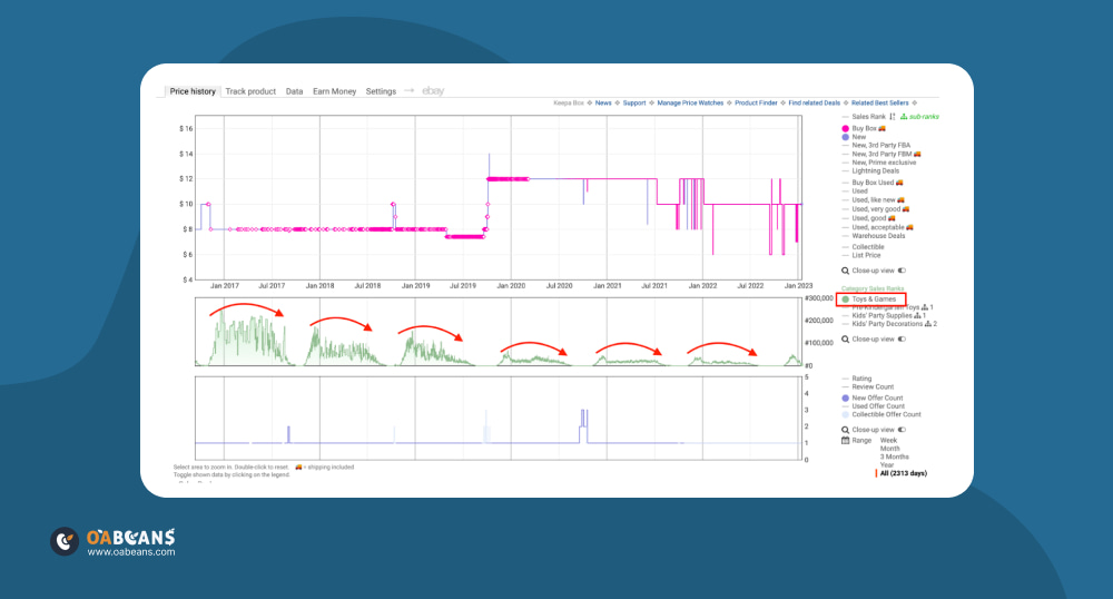
All advanced sellers already know this, but for beginner sellers, it’s very important to understand that Keepa charts also show sales rank movements, which is also called BSR ) Best Sellers Rank(. If you want to know What is BSR, read our article first. In Keepa, this part is shown by a green line on the chart.
So, what does it mean?
Sales rank shows how well a product is performing compared to other products in the same category at the same time. It’s based on how many people are buying the product. If a product has a rank of 1 or 2, that means it’s selling a lot and it’s a good sign for sellers.
Now, how do you analyze the green line?
- If the green line drops downward, that’s a good sign; it means the product just made a sale.
- If the green line keeps moving up and down, that means the product is selling regularly, which is usually very positive.
- But if the green line keeps going up, that means the product hasn’t sold in a while, and you should be more careful about choosing it.
Spotting Amazon’s Involvement and Its Impact
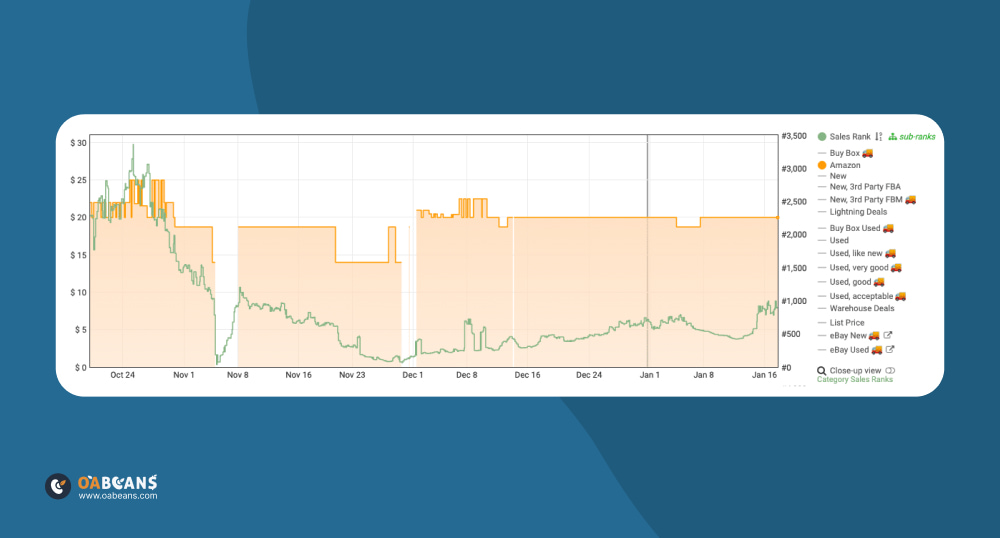
Another very useful part of the Keepa chart is how it shows Amazon’s activity with a product. The orange shaded area on the chart means that Amazon is actively selling that item. This tells you that Amazon itself is listing the product, not just third-party sellers.
If you see a white gap between the orange areas, it means that during that time, Amazon was out of stock. This is usually a great opportunity for third-party sellers to step in, sell the product and possibly even raise the price.
However, be very careful when Amazon is in stock. Competing with them is often very difficult, because they usually offer the lowest price and have a high chance of winning the Buy Box. That means it’s hard for other sellers to make a good profit. This part of the chart is especially tricky for beginner sellers who might not realize how tough it can be to compete with Amazon on these listings.
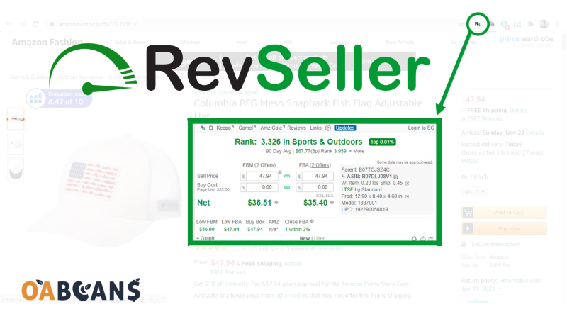
Utilizing Keepa for Competitive Analysis
Keepa is the first choice for anyone looking for the best analysis tools on Amazon. One of its helpful features is that it shows you the New Offer Count which lets you see how many sellers are offering the same product.
If the number is high, it means there is a lot of competition for that product. On the other hand, if the number is low, it may be a good time to enter the listing, since there are fewer sellers.
Another valuable feature in Keepa is that it lets you see who is winning the Buy Box and how often. If the Buy Box winner keeps changing quickly, that usually means sellers are using different pricing strategies.
One more helpful insight from Keepa is seeing when other sellers go out of stock. If you notice a drop in the number of sellers, that can be a good time to increase your price and potentially earn a higher profit.
Advanced Features and Filters in Keepa
In this part, we will show you different features and sections of Keepa that help you track history, analyze data, and make better decisions. Keepa also has many advanced features that allow every seller to filter information based on their needs and find new opportunities to make a profit.
| Feature | Description |
| Time-Period Filters | View data for custom timeframes |
| Advanced Data Tables | Includes metrics like Buy Box share %, average sales rank, and offer count. |
| Monthly Sales Volume | Shown as a yellow/gold line to estimate how many units a product sells monthly. |
| Product Finder | Search products using detailed filters |
| Top Merchants | Identify and analyze top-performing Amazon sellers |
| Price Drop/Increase Alerts | Set up alerts for price drops/increases on specific products |
| Category Tree Browsing | Explore product listings by category |
| Toggle Chart Elements | Show/hide data types like Amazon, FBA, FBM, Buy Box, New/Used offers, etc. |
Common Mistakes to Avoid When Reading Keepa Graphs
There’s no doubt that reading a Keepa graph can be very helpful for making smart decisions. But the most important part is knowing how to analyze and interpret the data correctly. Many beginners and even some advanced sellers make mistakes that lead to the wrong conclusions about a product, its pricing, and overall potential.
- First, don’t just look at a few days or a week of data. You should always look at long-term trends, like the past 90 or 180 days, because short-term changes don’t always show the full picture.
- One of the biggest mistakes beginner sellers make is not checking how many other sellers are on the listing. A high number of sellers means there’s more competition, and at the start, that can make it hard to earn a good profit.
- When analyzing BSR don’t just look at one single point. You should look at the overall direction of the green line over the past few months to understand the product’s true sales trend.
- Mistakes can also happen on the technical side. If you display too much or too little data on the chart and don’t use the right filters, you might miss important insights. Also, if the zoom level or scale is off, the lines can overlap or look confusing, making it hard to understand the real trends. So, it’s important to keep your chart settings clean and focused for clear analysis.
How OABeans Enhances Your Keepa Analysis Experience?
If you need help learning how to use Keepa and read its charts, we at OABeans are here to support you. Our guidance is not just limited to Keepa, we also help you understand how to use other tools, how to choose the right products to sell, and how to build a more effective strategy. We provide access to high-quality leads and offer lots of resources to teach you how to succeed.
In addition, we recommend Keepa Best Alternatives & Competitors, giving you a broad overview of different tools that might be easier to use or better suited to your specific needs. Whether you’re a beginner or experienced seller, OABeans is here to help you grow.
Final Thoughts
One of the smartest steps for anyone wanting to succeed as an Amazon seller is learning how to read a Keepa graph. It gives you access to powerful insights about important areas of your business like pricing trends, competition levels, product demand, and more. If you can understand Keepa’s data clearly, you’ll be able to make confident decisions that protect your profits.


11 responses to “How to Read a Keepa Graph?”
With retail arbitrage, you can explore various retail stores, clearance sections, and discount outlets to source products with profit potential.
Retail arbitrage on Amazon offers a low barrier to entry, making it accessible for individuals looking to start their own e-commerce business.
With FBA, you can offer hassle-free returns, building customer loyalty and satisfaction.
The comprehensive analytics and reporting provided by Amazon help online arbitrage sellers track their sales performance and make data-driven decisions.
As an Amazon FBA seller, you benefit from the Prime eligibility, which makes your products more attractive to millions of loyal Amazon Prime members.
The global reach of Amazon FBA enables sellers to expand their business internationally and reach customers around the world.
With Amazon’s robust customer feedback system, you can build trust and credibility by providing excellent products and customer service, leading to positive reviews and ratings.
The FBA program offers fast and reliable shipping, which is essential in today’s competitive e-commerce landscape.
By engaging in retail arbitrage, you can uncover clearance and closeout deals in physical stores, providing significant profit margins when reselling on Amazon.
Retail arbitrage on Amazon allows you to bundle complementary products sourced from different physical stores, creating unique offerings for customers.
By staying updated on Amazon’s policies and guidelines, online arbitrage sellers can ensure compliance and maintain a positive selling experience.